
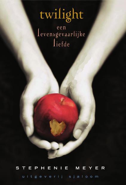
Perhaps one of the most iconic covers in YA ~ the hands and the apple
Because it has to be done...
Here are some of the international (apple-free!) covers of Twilight
Because it has to be done...
Here are some of the international (apple-free!) covers of Twilight
US/Aussie/NZ/UK/who knows where else?

Denmark


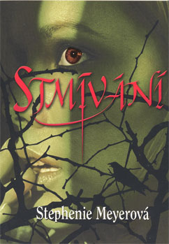
Going for the spooky-mystery vibe... but with two fun love hearts (it makes me think of those helium balloons) to lighten the atmosphere. I keep thinking I can see a face (or faces hidden in the background).
Thailand
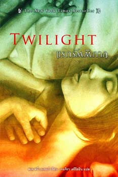
I first thought this is from Edwards' POV (watching Bella as she sleeps, haha)
But then I saw his little face, faking sleep alongside her.
It's got a romantic vibe ~ nicely done.
(and how long is Bella's oh-so-tempting neck!!?!)
But then I saw his little face, faking sleep alongside her.
It's got a romantic vibe ~ nicely done.
(and how long is Bella's oh-so-tempting neck!!?!)
Japan

oh the teen drama.
this is all about ANGST and MOODINESS
and something luminous...
this is all about ANGST and MOODINESS
and something luminous...
China

This is fun. Edward's hot, Bella's vulnerable
and there's (my fave part) bat wings (!) on the title ~ wahoo!
What more could you want?
and there's (my fave part) bat wings (!) on the title ~ wahoo!
What more could you want?
Russian

heheheheh
similar to Denmark but less atmospheric/more creepy
the trees are growing out of her headand branches falling over her face
and as for her expression? I'm not really getting this one...
similar to Denmark but less atmospheric/more creepy
the trees are growing out of her headand branches falling over her face
and as for her expression? I'm not really getting this one...
Korean
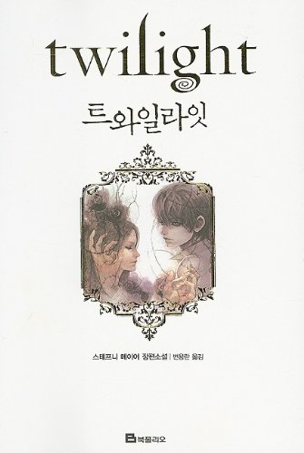
It's cute, hey. A little bit elfin. Lots of white space.
Looking at it closely, I am having trouble making out what is going on at the side of bella's head?
Is that Edward's hand? Kind of gnarl-y...
Looking at it closely, I am having trouble making out what is going on at the side of bella's head?
Is that Edward's hand? Kind of gnarl-y...
Germany
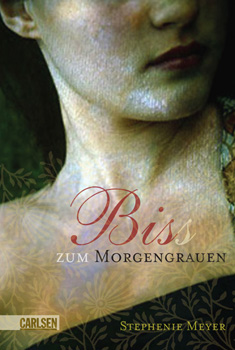
This looks more mermaid than vampire with that pearly, underwater sheen.
Initially the image was lost on me ~ 'why show a girls neck and half her head?' ~
Then I was, like, 'OH! her neck... his vampire fangs... love story...aha!'
Initially the image was lost on me ~ 'why show a girls neck and half her head?' ~
Then I was, like, 'OH! her neck... his vampire fangs... love story...aha!'
Czech Republic
I like this cover, love the bird in the branches and the light and shadows and the jagged, sharp font.
It looks like a different genre to Twilight though (?)
It looks like a different genre to Twilight though (?)
Norway

I'm sure I've seen this image somewhere else...
Either way ~ it doesn't really grab me.
Either way ~ it doesn't really grab me.
Netherlands
Indonesia
so Rapunzel-esque
I like it as an artwork (really, I do) but I fail to see the connection.
I like it as an artwork (really, I do) but I fail to see the connection.
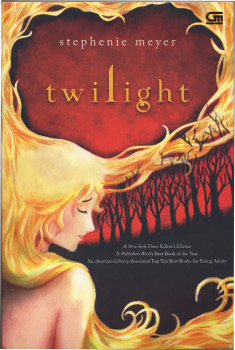
Original UK

When I first saw this original UK one I thought it was completely not-for-real. I like the title font and the ethereal feel but the girl looks seriously thin and she's caught in a mid-dope stare. Bizarre.
There's also the white cover ~ so iconic that it is devoid of title or author name on front (asuuming these are available throughout the western world? They're out here in Oz)
 It's hard to say which ones appeal to me. The main apple one is so familiar that it works as a branding. Although, I don't know the book well enough to really understand what the hands and the apple are about(Twilight is not really my thing)
I like the Czech Republic one (even though it looks like an adult suspense-thriller).
Plus I do think the Chinese one is fun :D
Have you seen these before?
Which one is your favourite?
Which ones are making you go 'what the?'
There's also the white cover ~ so iconic that it is devoid of title or author name on front (asuuming these are available throughout the western world? They're out here in Oz)
I like the Czech Republic one (even though it looks like an adult suspense-thriller).
Plus I do think the Chinese one is fun :D
Have you seen these before?
Which one is your favourite?
Which ones are making you go 'what the?'


Fake sleeping LOL xD
ReplyDeleteI think I like Thailand best.
ReplyDeleteI really like the US hands an apple cover the best, but some of the others are nice.
ReplyDeleteAnd the hands and fruit is symbolic of the "forbidden fruit" ideology. ;)
I think it's very interesting that one edition has the same cover - except for the bite out of the apple. And I much prefer the black covers to the white. It's cool that the images are so iconic they stand on their own without needing title or author, but black makes it stand out better. Also, working in a bookshop I discovered that the white covers get damaged or dirty very quickly, for some reason. I'll be dull and say the black cover is the best. It certainly grabbed me, long before the story itself interested me.
ReplyDeleteThe candy on the cover of the Norway one remind of LA Candy by Lauren... Ugh, what's her name? From The Hills? Lauren Conrad: http://www.goodreads.com/book/show/4758093-l-a-candy
ReplyDeleteI think it's a wildly overused stock photo.