
hard cover verse paperback is a sporadic feature @ inkcrush
all links for blurbs, etc, go to goodreads
the four books featured today are all currently available in hard cover and pre-orderable in paperback.


hard cover paperback
Both of these are conceptually awesome. There's been a lot of thought into integrating the title to match the theme. I LOVE the skinny apple on the paperback.
My favourite? hard cover.
I can't go past that electric shiny purple of the hard cover. It really grabs my attention <3

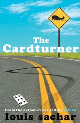
hard cover paperback
Hard cover: I love it. It's already got a unique vibe going on ~ kind of like a poster for a funky indie film. LOVE the spade in the title and the cleverness of the tagline. The use of white space is also really satisfying for some reason.
Paperback: I love this too. It's bold and vibrant and still has an off-beat feel about it. The colours work so well together and are really streamlined. LOVE the whale on the sign, the burn-out tracks and the card on the ground.
My favourite: ahh, I'm torn. Absolutely undecided. I think both are excellent covers


hard cover paperback
hard cover: While the colours are well matched and the cut necklace is clearly symbolic, I cannot say this cover does much for me. The cut pearls look... awkward.
paperback: I don't like this one either although I think it probably has better teen appeal than the hard cover. The bodies are headless (!) in a choppy way, and the whole scene just looks so posed. from the girls leg caught at a weird angle to the guy wearing that suit.
My favourite: sorry ~ I'm not really liking either :(
bonus: UK original cover and the (US) sequel cover:
you can see how the US sequel matches the new paperback theme.
I like the UK one the best out of them all...


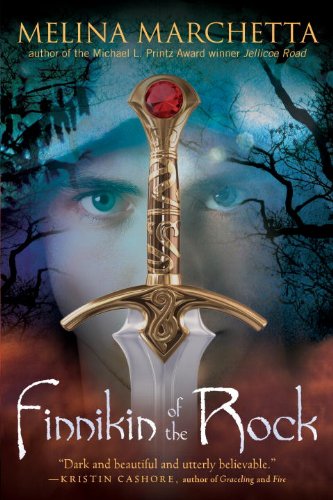
hard cover paperback

the new US paperback is an atmospheric blend of the US hard cover and the Aussie cover: -->
My favourite: the paperback. I think it's absolutely mesmerising ~ Finnikin's eyes are the focal point and then my eyes stray to the smoky background and ominous branches.
Which covers do you love the most?
Have a particular favourite?
xx Nomes


I like the hard cover for Fat Cat and the paperback for Finnikin of the Rock, but I much prefer The Cardturner in hard cover!
ReplyDeleteFat Cat - Hardcover. Anything purple is automatically my favorite.
ReplyDeleteThe Cardturner - Both!
She's so Dead to Us - UK original cover looks fun!
Finnikin of the Rock - Both seem equally compelling.
I love the paperbacks of both Finnikin of the Rock and Fat Cat, and prefer the hardcover of The Card Turner. I am with you on the covers for She's So Dead to Us, but if I had to pick one I would choose the pearls as I do like the symbolism there.
ReplyDeleteHey Nomes
ReplyDeleteI'm also not a fan of the headless people covers, lol. And I hate to say it but a lot of times if I've never heard of the author I judge the books based on their covers.
I just nominated you for the Irresistibly Sweet Blogger Award. You can get the details on my blog.
I think I lean more to the paperbacks in this case.
ReplyDeleteHe's SO Not Worth It is way cuter than the She's Dead to Us.
Finnikin's eyes! WOW! I'm frightened and swooning at the same time.
ReplyDeleteI prefer the hardcover of The Cardturner. It's cool without trying.
Fat Cat - Hardcover, not only because it's the one I got but because I don't really like the chips on the cover.
ReplyDeleteCardturner: I go with the pb, It has a cleaner feel.
She's So Dead To s - I don't really like the US covers, though if I had to pick I would go with the hardcover. The UK one is the best.
Finnikin : The AUSSIE COVER OF COURSE!!!
I don't like the US covers. The Hard cover (which I have) is MASSIVe and kind of awkaward in size, and the cover reminds me of the sword in the stone. The PB cover makes me think of the thundercats.
So! Aussie cover all the way!
I like the hardback of Fat Cat more, too. They're both great, but I like the purple.
ReplyDeleteI'm not sure I like either of the covers for The Card Turner. I'd be more likely to pick up the first cover I think.
I don't like either cover for She's so dead to Us. The UK cover is much better.
Both the fat cat covers are so unique and intersting. I love the chip packet in the paperback and the hard cover is very eye catching.
ReplyDeleteI'm not a big fan of 'shes so dead to us' covers i do however like the 'Hes so not worth it' cover which has a very retro diner feel to it.
And finally i love the Aussie cover of Finnkin of the rock the best.
I love these posts their a lot of fun, i have to say never get tired of pretty book covers a lot.My mum only buys books depending on the pretty cover which isn't the best method but they do look lovely in her bookshelf.
-Abbeys bookshelf
The cover design for the hardcover of The Cardturner was one of the reasons why I picked it up. The paperback looks really good too. I like how different they are from each other but they both look nice.
ReplyDeleteI love this feature. I don't know how you keep track of all the covers but I am glad you do.
ReplyDeleteI love the HB Fat Cat cover. I think it is the simplicity of it.
The Cardturner I like the HB again. Just the feel of it.
The She's So Dead I don't really like either as well. But at least the paperback matches well like you said.
Finnikin of course the PB. It has that gorgeous face with striking eyes. It is nearly as pretty as the Aussie cover :)
I also love this feature because I love fangirling over covers!
ReplyDeleteAnd the hardcover for fat cats is AMAZING!
I love both covers for Fat Cat! I can't choose :/. I think I prefer the paperback for The Cardturner though I like both, and I like the hardcover of She's So Dead to Us best. As for Finnikin of the Rock - paperback. It just looks cooler somehow! Thanks for this post, I love discussing covers!
ReplyDeleteFat Cat- I don't think I like either of them, haha.
ReplyDeleteThe Cardtuner- I think it would be more likely for me to pick up the hardcover :)
She's So Dead to Us- I really like the font on the paperback! I've heard people love these books, I really should read them!
I like the Finnikin paperback as well! :)