
Hard Cover V Paperback is a sporadic feature of inkcrush where I chat about which cover I prefer, etc...
(sorry for the formatting of pictures in this one ~ blogger's a bit messy ;) ~ driving me wild, so am leaving as is and moving on ...)
Split by Swati Avasthi


Hard Cover V paperback
FIRST: the paperback is still at a bargain preorder (for Jan 2012) price.
It's one of my fave reads this year... so get to it :)
Hard cover: I liked it. The key is part of the story. The red, black and white are arresting. I am SUCH a fan of lowercase, I can't help it, I just am. ALSO ~ I didnt spot it for a while (then had a 'duh' moment) but there are profiles in the cute of the key. cool optical illusion...
Paperback: Normally I am not too fussed over having models on a cover. But, I am REALLY digging this. I love him in profile, love the black and white (it's evocative) love that floppy hair ;) It's curious it is the same colour scheme as the hard cover ~ yet so dramatically different in vibe. Also, it's uppercase is cool here ~ so understated and simple. Like the opposite of the hard cover.
My fave: I am LOVING the paperback. I know there's not much to it, but it's calling out to me. I love it's simplicity. I think it is going to look stunning in the flesh (I am almost tempted to buy it, just to have another copy of one of my favourite books ;))
I'll Be There by Holly Goldberg Sloan
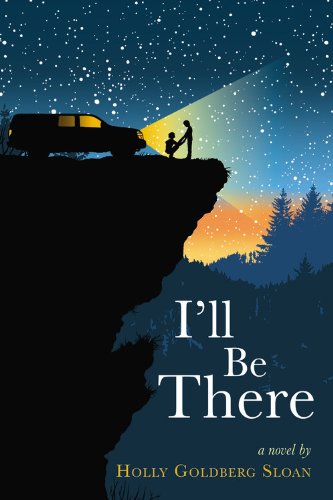

Hard cover V paperback
Hard cover: You guys ~ this one is one of the most coveted covers of the year. It's mesmerising and gorgeous and such a stand-out with it's illustrative work. I have heard it is equally gorgeous on the inside (interior design, LOL, is it called that? Whatever). This one feels like a picture telling a thousand words. It's practically screaming READ ME.
Paperback: Initial reaction: looks like the face on the new Delirium (Lauren Oliver) cover. Oh, there's a boy, whispering and/or sniffing. I do like the concept, how if you go cross-eyed, you notice more of him than her. I'm a fan of the colour and the black and white and I especially love that slightly fuzzy red font. It's only when I think about this cover that I find things to admire, it doesn't grab my instant attention...
My fave: I get why publishers change things, I do. But that aside... WAHHH! I LOVE the hard cover SO MUCH. I do not own it (haven't read it). I am not a hard cover girl, I prefer buying paperbacks. But this one is making me think investing in the hard cover of this book may be worth having it on my shelf... (I could handle the paperback though, it just seems such a shame to miss out on owning that hard cover masterpiece)
Ten Miles Past Normal by Frances O'Roark Dowell

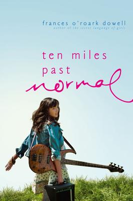
Hard cover V paperback
Hard Cover: I loved this cover when I saw it last year. The girl, the paddock, the guitar, the dots of what looks like black sheep, the unruly grass and the scattered font. I wanted the book based on the cover (and title ~ which also rocks) alone [note: I kept an eye on reviews, and then didn't think the book was for me after all :/ ]
Paperback: I REALLY love how the two versoins are tied together by the same photo shoot. So I am just going to compare aspects here. I like the font in the paperback better (more unruly). Somehow, the girl looks photoshopped in on the paperback ~ she's so much more CRISPER. I do prefer seeing the farm on the hard cover ~ kind of cooler for some reason. I like the gradient in the sky on the paperback, makes the hard cover seem flat in comparison.
My favourite: I don't have an obvious one. They are both pretty funky. Maybe the hard cover looks more original and eye-grabbing? I would blend in my fave paperback aspects and smish them together on one cover :)

Cryer's Cross by Lisa McMann


Hard Cover V paperback
Hard cover: Creepy. I LOVE this cover. I love how it matches in with Lisa McMann's US editions of the Wake series, yet is it's own thing entirely. The scratchings on the desk are genius (I love creative title text). I love how the background fading out makes the centre luminous. The old style table and chair set are spooky sitting there, all ominous-like. Love the colours and tones.
Paperback: ... So ... While the trees are going for spooky, the scene is going for telemovie romance. It's like a tame harlequin cover or something. This is a YA book, right? The couple on this cover look too old to be teens to me (?). I haven't read the book, so I can't comment on how well the cover portrays it's contents (in terms of vibe, genre) but it looks like they are marketing two different stories to two different audiences.
My fave: Hard cover. Creative, simple and effective. The paperback is so generic, and I have NO IDEA what the book is about based on it?
What are your faves? Any you don't like?
My verdicts:
Split: paperback
I'll Be There: hard cover
Ten Miles Past Normal: mutual :)
Cryer's Cross: hard cover


I haven't read Split yet. Gasp. :o
ReplyDeleteDefinitely hardcover for I'll Be There. It's so mesmerizing, and I would love to have that on my shelf. :)
I like the paperback for Ten Miles Past Normal.:)
And yes, hardcover for Cryer's Cross! No on the paperback. The hardcover has the creepier vibe. :)
I was SPLIT on grabbing a paperback copy of SPLIT, but now that I think about it I'll probably get it. It's been so highly raved and it sounds like my kind of book. :)
ReplyDeleteI really don't like the PB of I'LL BE THERE. Doesn't do anything for me at all, while the HB is beautiful.
I like both covers for TEN MILES PAST NORMAL. I like the farminess and wildness of the HB, but the PB is just so pretty! I'd happily grab the PB and save some dollars.
And CRYER'S CROSS...come on. PB is such a no-no! Love the creep factor for the HB! And I agree - the models look old.
I like the paperbacks more for the first three, and the hardcover for the last.
ReplyDeleteSplit, just wow, that would really speak to me if I saw it in a store and while the keys with the profiles inside it are intriguing, it's not obvious enough to me to stand out. In Ten Miles Past Normal, I like the concept with both (and now I want to read it!) but for some reason the picture of her walking seems more natural, not sure why.
Love this feature.
Oh - and i just read Froi!!! LOVED IT!!! Crushing so hard right now.
Lovely post! On the covers, I like the paperback Split - conveys a wonderful sense of emotion that the first one lacks.
ReplyDeleteI'm with you on the HB I'll Be There!
And I really love the HB 10 Miles - it just has something going on with the title's word spacing - gives it great quirkiness. I think the second feels more like a magazine cover, albeit a great one!
The PB Cryer's Cross gives me the creeps. Major.
LOVE the post, Nomes!
Ahh man, first time i've seen that Split PB cover... it's callin out to me too, sista. It just got that whole *gestures*.... thing going on that I'm loving, and I just really like the font for the title too.
ReplyDeleteAnd oh look, here goes me having an opinion for all of these now haha ;P
for i'll be there.. when I saw the pb... my reaction: "nooooooooo"!!!! GAH. WHY WOULD YOU CHANGE THAT COMPLETELY BREATHTAKINGLY BEAUTIFUL AND GORGEOUS AND SOMEWHAT MAGICAL COVER?
I kind of like the way the title for ten miles for the HB a bit more, so I guess that'd be my choice :p
and ew for CC PB lol :p . that's it.
i love these posts :) and I really want to go and reread Split... none of the bookstores have it here!! :(
*oh, and by the super nonspecific 'pb' i meant I'll Be There pb, haha
ReplyDeleteI don't have a copy of the PB yet, but I hear that the cover itself will be in mat, but the title will be glossy. So excited to get my hands on it.
ReplyDeleteThanks for the compliments on SPLIT! :)
I prefer hardcovers but I think paperbacks always have the cooler covers.
ReplyDeleteAwesome post! I loved Split, and the paperback actually pertains to the story, which I love. The guy's hair is SO nice- I just want to touch it!
ReplyDeleteAhem.
That cover for I'll be There is SO good that the pb just doesn't match up. And I love both the covers for Ten Miles Past Normal. Cryer's Cross- DEFINITELY the hardcover.
I really like this feature! I might participate in it sometime though I'll credit it back to you.
ReplyDeleteI like the paperback of SPLIT for all the reasons you said.
I actually like the paperback of I'LL BE THERE. I'm not a fan of the HC copy at all (I know, I'm killing you).
Both PAST NORMALs are awesome.
And I like both covers for CRYER'S CROSS!
Love, love, love this!
I just read Cryer's Cross and OH MY GOODNESS I LOVED IT!
ReplyDeleteBut I don't get the paperback version... it's pretty enough, and I like the really stiffu body language in the female cover model, but the hardcover is PERFECT. SO creepy and menacing--exactly the right feel for the book!
ooh I LOVE the hardcaover of I'll be There - why did they change it! Why, why??? It was such a stand out and now it looks like loads of other books out there.
ReplyDeleteThink I like all the hard covers best actually :)
Split: I agree the paperback is stunning. I want it. And I own the hardcover lol. Its the way they've done the text I think and the colours that I love so much.
ReplyDeleteI'll be There: I do like the paperback but its no competition when you look at the hardcover version. Not enough illustration is used for book cover designs I think.
Ten Miles Past Normal: I actually don't like the hardcover it looks very awkward to me - the way the hair is covering her face (I just want to brush it back lol) the positioning of the text makes it an effort to read the title, the colour of the sky. The paperback is much better, crisper and far better font.
Cryer's Cross: The paperback is awful lol. Looks like some romance novel and Im pretty sure going off the odd review Ive read its meant to be a horror/thriller. Also the guys is channelling Edward Cullen too much. All I can think about is the god awful second movie where they are lying in purple flowers or something like that.... Anyway. Hardcover has a creepy vibe - that one definitely wins :D
I'm not a fan of the paperback cover for I'll Be There! I was waiting for that to come out in paperback before I get it but like you, I'm trying to decide if it will be better to just invest in the beautiful hardcover. I've heard good things about the content.
ReplyDeleteI totally agree with your assessments, especially re: Cryer's Cross. I totally winced and made a "what the WHAT?!" face when I saw the paperback. For some reason so many people didn't seem to get that it was a desk on the hardcover, I don't know why, so maybe that's why they changed it... but to change it to THAT?! So strange.
ReplyDeleteAnd the HC of I'll Be There is so stinkin' beautiful and striking, it's really too bad they changed it. =(
Blahaha
ReplyDeleteI didn't even notice the guy in the background on the paperback of I'll Be There until you mentioned it. So weird.
Love the illustrative cover best.
i'm "split" on split. ;) digging both the HC and the PB.
ReplyDeletethe only one i have a definite opinion on is Cryer's Cross. LOVE the HC!!