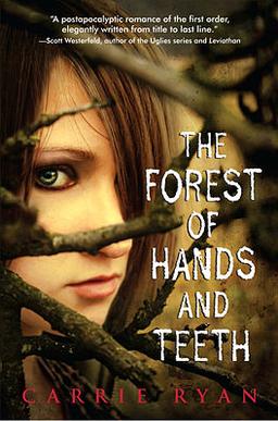
US Hardback
US Paperback
UK/Australian
I've heard some people say they love this cover. Um...?
I own this and I am so clueless that I still can't figure out what the red thing is even in the flesh.
I just don't get this cover.
What does it mean?
Thank God she has the coolest title because I would not pick up the book based on this cover.
German
Why call it just The Forest? I love the original title.
So, this looks slightly melodramatic (that hair!), but I say, bring it on!
I love the title text and the misty green feel about it.
And the ominous robe-y people looming in the background (the sisterhood?).
Okay, maybe they're not ominous and I am just projecting that onto them, but I'm liking it
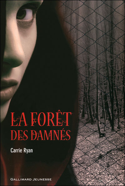
French
Ahh, I love French covers.
This appeals to me with that elusive expression on the models face.
And the forest feels post-apocalyptic - barren and desolate.
Plus, the red hood is nicely done, blurred, then focused.
That's it guys :)
Normally, I only show real editions
BUT
I found a fan-made Portuguese edition (the read Portuguese edition is a slightly bluer copy of the US hard cover) designed by Marina from Underworld and I just wanted to chuck it up here :) I think she did a fab job.
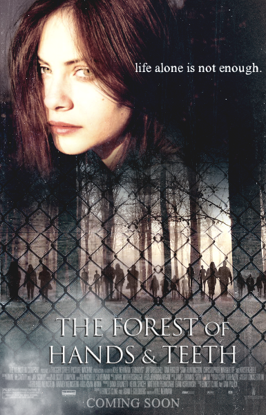
Also, 100% fake from Deviant Art I bring you:
Because I so can't wait for the movie.
And I'm liking this fan-made movie poster.
Anyway, back to covers.
Which one's your fave?
I'm in the mood for drama and I'm liking the French and the German ones.
The US are fine too.
I do feel a bit ripped off with the Aussie edition
but the title makes up for it... kinda :)
Cover Comparison Thursday is a weekly meme hosted by Bailey @ Abyss


Once again I am in total agreement with you. The French is the best and I adore the movie poster which would also have made a great cover, and the fan design is better than most of the originals too.
ReplyDeleteI don't hate the UK one, but it is a marked change from all the others. Overall I am with you, the Frenchies have it! (Viva la France!)
ReplyDeleteI like the French and the US hardback. I don't like the US paperback. It looks like she's wearing makeup and where the hell would she get makeup in that world??? The red thing on the UK version - hmmm... my first guess is a dried up leaf and it's colored red for that zombie with the red hair? Just a guess.
ReplyDeleteI love the US hardback the best, personally. I really dislike the paperback version. The composition is overcrowded and everything looks like it had to be squished to fit on the cover. Plus, the character is wearing make-up and looks absolutely nothing like Mary--can't remember if she was described or not, but I imagined her as the one on the hardback cover.
ReplyDeleteDef US hardback and the German-- plus the two fakers totally rock
ReplyDeleteI like the U.S. harback. That's just how I picture Mary. Simple clothes, no makeup. And I like that it's more than just her face. The U.S. paperback confuses me because she's wearing makeup (which doesn't exist anymore in their society). But I do like the branches even if the nobby thing is misplaced. lol.
ReplyDeleteAs for the U.K. cover, it looks to be a dying flower. I think it's cool and if I'd still pick up the book. I'm not sure what it has to do with the story exactly though.
I really like the fan made ones the best!
ReplyDeleteOMG! This is so true! What the heck is the red thing?
ReplyDeleteLOOVED the fan made art!
I love the first one, The US hardback. Its the dramatic look of the hair that actually draws me to this particular cover. Yes I love the muted colors and the foggy feel of the overall scene (all of which give it, as you say, a "creepy" feel), but it's the hair that attracts my eyes. I think its the way the her hair sort of emulates the branches above it. Of course, I have nooooo idea what this books is about, so when I get to reading it, perhaps I'll feel differently :)
ReplyDeleteyay for thursday! book cover comparisons are my fave posts. :)
ReplyDeletei actually like the red thing against the lighter background, but you're right - i can't tell what it is.
and i like both the cover and the fake movie poster with the creepy people in the background.
Seriously, the French make the coolest covers! And the fan-made Portuguese one rocks.
ReplyDelete<3
Is there anything about birds in that book, because I swear, the first thing I saw in that flower picture is the face of a bird. Does anyone else see it??? Maybe I've been viewing too much Escher in my life LOL
ReplyDeleteYour blog is so awesome!
ReplyDeleteI also like to search for foreign covers of my favorite books :) So, if you don't mind I'll give you links for hungarian editions.
Here is the hungarian cover for this book: http://www.ilovebooks.hu/product/kezek-es-fogak-erdeje-elhet-e-a-szerelem-egy-pusztulo-vilagban.html
Another piece for your collection :)
the German cover actually means "The Forest of A Thousand Eyes"
ReplyDeletecol, right?