
I haven't done one of these for a while...
this international cover comparison is for my good mate Melanie - it's her fave YA series :)
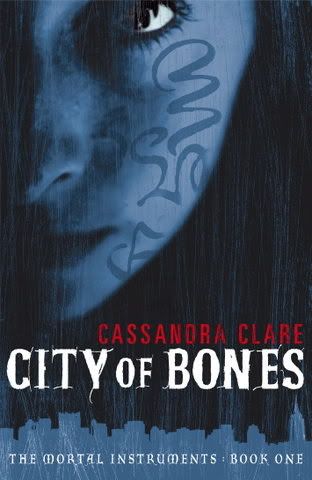
US
this international cover comparison is for my good mate Melanie - it's her fave YA series :)
US

This cover is just striking, really.
Early UK/Australian Edition
I only ever saw this version in a Dymocks catalogue, all my shops now stock one very similar to the US.
I do like the cover though, the layers in the blue, and the hair falling over her face is somehow compelling. And the font has it going on. But it's not a stand out for me.
I do like the cover though, the layers in the blue, and the hair falling over her face is somehow compelling. And the font has it going on. But it's not a stand out for me.
Italy
Titled: Shadowhunters

Not sure what's going on here?
Looks like some sort of sniffing ritual.
It makes me think of mimics and drama students for some reason?
Still, it is kind of... smooth? sleek?
Looks like some sort of sniffing ritual.
It makes me think of mimics and drama students for some reason?
Still, it is kind of... smooth? sleek?
Germany
Titled: Chronicles of the Underworld
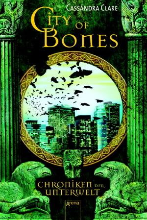
this makes me think of covers from the 90's
and looks slightly more fantasy than urban fantasy.
also vaguely, weirdly, reminds me of an underground level on my old 90's Sonic the Hedgehog game. Ahh, my old Sega...
and looks slightly more fantasy than urban fantasy.
also vaguely, weirdly, reminds me of an underground level on my old 90's Sonic the Hedgehog game. Ahh, my old Sega...
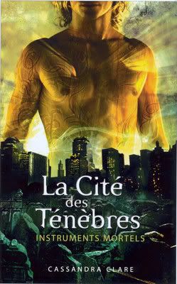
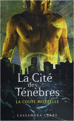
French
Titled: The Mortal Cup
Polish
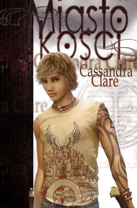
I actually like Jace here - he looks the right age (not so god-like as the US edition)
I like the hilt at his wrist.
the rest of the cover though, doesn't really come together for me.
I like the hilt at his wrist.
the rest of the cover though, doesn't really come together for me.
Spanish
Titled: Hunters of Shadow
Portuguese
both these are similar - and also (I think?) the cover of the second book in the series on the US edition)
both these are similar - and also (I think?) the cover of the second book in the series on the US edition)
 |
| Spanish |

Bulgarian

I like the illustrated look.
I like the hair tendrils and the smoke. I think if you're going to go dramatic, have the confidence to go all the way. It comes together nicely with the 3D city.
I like the hair tendrils and the smoke. I think if you're going to go dramatic, have the confidence to go all the way. It comes together nicely with the 3D city.
Bulgarian

Same again, I'm a fan of the illustrated version.
It does look a teeny bit like he's shaking his hair dry after having a shower.
But who cares? It works for me :)
It does look a teeny bit like he's shaking his hair dry after having a shower.
But who cares? It works for me :)
Czech

heheheheh.
a tad B grade movie-esque.
Props for going with a scene out of the book though.
I think Jace looks better sans shirt ;)
(here the shirt is billowing out and then fades away. huh.)
a tad B grade movie-esque.
Props for going with a scene out of the book though.
I think Jace looks better sans shirt ;)
(here the shirt is billowing out and then fades away. huh.)
Turkish

Just to be different, lets show the back instead of the chest!
mysterious! moody! angsty!
The most popular cover is a variant of the US edition:
mysterious! moody! angsty!
The most popular cover is a variant of the US edition:
 |
| Danish |
 |
| Hungarian |
 |
| French |
And the Comic Book :)

Niiiice.
Which edition is your favourite?


I love the Italian covers:)Think it's just a gesture of intimacy and no sniffing:D
ReplyDeleteI like the US one and its variants.
ReplyDeleteThe Italian cover makes it look like the models have decided to play Holi. Lol.
Also, like the comic book one. It's cute.
i agree, the us version and the ones like it are best. i keep meaning to read this, all my friend are in love with jace.
ReplyDeletexxxxx
I love this meme! I like the Bulgarian cover especially for City of Ashes :)
ReplyDeleteI just started reading it. I love the Italian and Spanish covers. :)
ReplyDeleteThe US cover actually put me off reading this but I have finally cracked to peer pressure and have it at the top of my pile for my December reads for NaNoReaMo :) I hear there is an amazing twist and so far I've avoided hearing what.
ReplyDeleteI don't think any of the covers would make me pick it up though.
I love the Italian covers! Sadly, I did not like the book as much asI expected to.
ReplyDeleteIt's amazing how different the covers can be, I have the US version and I have to say it's my favourite. There's just something about nice chesticles......... :-P
ReplyDeleteOkay, you know that this series is my absolute FAVORITE of all time, so the fact you did this...I swear if you were in front of me I would have hugged your tighter than you've ever been hugged!!!!
ReplyDeleteEven though I don't usually like faces on my covers (because I feel like it takes away from my imaginary view of a character), I really like the Polish one. I love the US one (that I have) because I love the way they display all the markings on Jace and the way he stands over my city (yes, my city hahaha), but I never felt the body belonged. It looks like the body of an older man and even though I picture Jace to be well toned, I picture it on a more youthful build. More like the one on the Polish cover. I hate the Italian one. Doesn't match the story to me at all and feels misleading to the story. The German one is kinda cool and has a portal type effect which I dig. Don't care for the UK/Australian one because of the face and because they put markings on her face which is not the right feel.
Okay, you know that this series is my absolute FAVORITE of all time, so the fact you did this...I swear if you were in front of me I would have hugged your tighter than you've ever been hugged!!!!
ReplyDeleteEven though I don't usually like faces on my covers (because I feel like it takes away from my imaginary view of a character), I really like the Polish one. I love the US one (that I have) because I love the way they display all the markings on Jace and the way he stands over my city (yes, my city hahaha), but I never felt the body belonged. It looks like the body of an older man and even though I picture Jace to be well toned, I picture it on a more youthful build. More like the one on the Polish cover. I hate the Italian one. Doesn't match the story to me at all and feels misleading to the story. The German one is kinda cool and has a portal type effect which I dig. Don't care for the UK/Australian one because of the face and because they put markings on her face which is not the right feel.
Awesome feature, Nomes! I have to say that I'm a big fan of the US covers the most. The intricate details really capture me every time :)
ReplyDeleteOh, I love the Polish cover. It's gorgeous. And the Bulgarian covers are very pretty, too.
ReplyDeleteGotta say I love the US one. The polish one, he looks too little? skinny? Young? I don't know. I just got my son's daycare teacher hooked on these. Awesome post!!
ReplyDeleteI've only ever seen the US cover in Australia and it is also what we used to stock in the store I worked in. It is still my favourite cover but I also like to Bulgarian one as well
ReplyDeleteThat's so funny Angie, because I have the opposite reaction. I feel like the US cover makes him look too old and mature. It looks like the body of a 20 something year old to me. Shrugs. Strange how our minds make such different fitting images.
ReplyDeleteItaly... what were you thinking??
ReplyDeleteI actually love the Bulgarian cover the best.
I love the Bulgarian covers! Fabulous stuff ;)
ReplyDeleteI really like the US cover. That rocks.
ReplyDeletehttp://ficklecattle.blogspot.com/
Oh, I love this series! I have to say I like the US one the best... I'm biased I guess.
ReplyDeleteI like to the Polish one and the comic book version, but I think I like the US version best this time.
ReplyDeleteItaly and Germany :)
ReplyDeleteI agree, Jace looks way too old and mighty in the U.S. colors and the Polish one has the right age. I really like the Bulgarian one! Like you said, dramatic! The Italy one is different... "sniffing ritual" haha! yes! I agree too with the Germany cover, it does look like a 90's fantasy cover.
ReplyDeleteI love this post!
that french title is literally "the city of darkness", not 'the mortal cup'. i think that US cover is great, the polish one is quite awful and makes it look like a book for younger readers and i really like the german one!
ReplyDelete