Cover Comparison Thursday is a weekly meme hosted by Bailey @ Abyss. Head over there and link to your blog to join in.
This week I have ten covers for Kristin Cashore's Graceling
US and Canada
I love this cover. It's very distinctive and stands out (in a way that could become iconic) I love the textured look of the colours in the background and the blues and greens look great against the yellow. The font is perfect and I love the reflection in the sword.
UK, Australia and New Zealand Adult Edition
This is the one I own :) It's really different to the US one, but I like it. A lot. When I was reading it, I kept flipping to the front to look at it :) I love the stance of Katsa and her outfit and the snow in the background and the font. I loke how the snow in the foreground blends into the clouds in the background. I think it matches the atmosphere of the book and personality of Katsa.
UK, Australia and New Zealand Young Adult Edition
Okay, so I love the Adult version of this - but the YA version does not a lot for me. It just looks too dark and doesnt have the same atmosphere. It doesnt have the same little details, a lot more bleak...
UK Large Print Edition
Katsa reminds me of a nun here. A nun who is about to play cricket with her sword. And what's going on with the sky? It looks like a pond. It looks like a book for old people. (actually, maybe that's why? It is the large print edition, haha ;)
German (title translates to:"One Who Has been Given A Gift")
I like this cover. I love all the swirly stuff on the left hand side and on her neck. I'm liking the font and the hairstyle's looking pretty funky. But I'm not sure it's all that well suited to the story, it could be a cover to any book, really. Still, nice, nice :)
French
Not bad. For some reason makes me think of Dr Zhivago. Anyway, I like the colours and the feel of it. I like looking at it. Obviously, Po is a lot hotter than the boy on this cover (despite sharing his name with a tellytubbie). I like the looks on their faces: intelligent and determined. they look like people I'd like to read about, on some sort of an adventure...
Denmark
This kinda looks like one of those classic texts you have to read in high school. It's making me think of The Pilgrim's Progress. It's not calling out to me. I kinda feel bored just looking at it.
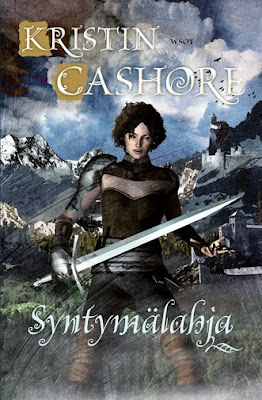
Finland
China
So, this one makes me grin :) it looks like exactly the kind of thing the Chinese would love, lol. It is arresting, the purple and blue, against the streak of blonde hair and the flawless porcelain face. I do like the bodice, not sure what's going on there with the collar? feathers? Because it's so busy with details, the pure face stands out. So, I wouldn't really say this is a fave, but I do think it's quite arresting.
In Catalan (language) Spain and Andorra
This one's hard for me to comment on. I am so used to seeing the US version, that it startles me. But if i forget about the US version and just look at this...wow. It's really striking. I love the indigos and blues and greys and the silver title looks stunning. The gold and blue in the sword looks particularly compelling against the background. I <3 this one. I think I may even like it better than the US colour scheme...
What about you? Which cover is calling out to you? Please, please, feel free to lay the love on ones that amused me :)


I just love the German one its divine....sigh....its all about the cover love
ReplyDeleteSome of these foreign ones are just funny to me - particularly the Chinese one. I guess I like the top and bottom one the best, but the german one is nice too.
ReplyDeleteI LOVE the UK/Australia/New Zealand cover. It's so striking! And I love the UK cover for FIRE even more. :)
ReplyDeleteThis is one of those cases where I really preferred the UK cover over the US one.
The German one is brilliant!
ReplyDeleteAnd I love the US and UK/Australia one!
I like the US and UK one the best... don't really like the German or Chinese ones though
ReplyDeleteThe Chinese one is actually kind of funny, though. It's like a Manga cover!!
ReplyDeleteMy favorite is actually the Chinese one (I'm a manga fan). Although I really like the UK large print one as well -- the contrast of dark and light in that one is simply gorgeous.
ReplyDeleteAustralian/NZ/UK all the way!
ReplyDeleteI love the US/Canada version. Just me!
ReplyDeletelove love love the last one. those blues are awesome and make the face on the blade stand out.
ReplyDeleteI like the UK, Australia adult version best. Looks so powerful!
ReplyDeleteThe German one is divine, and the Chinese looks a lotta fun. Love both!
This was so interesting! I tend to prefer the ones that don't go the way of "floating people in the sky" like a movie poster. They are all really particularly striking, though.
ReplyDeleteSuch a cool post! I love seeing all the variations. I think I like the UK, Australia one best.
ReplyDeleteI <3 these covers!
ReplyDeletei have the aussie adult one! i fell in love with it when i first held it even though before hand i had really liked the us version (now i reckon mine's better lol)
btw HI, I am Amanda, I am an Aussie blogger too! I just found you through Teens Read and Write.
I love finding more of us :D