
Cover Comparison Thursday (CCT) is a brand new weekly meme (now!) hosted by Abyss to showcase international covers of a certain book, and share our opinions on each.
(and this is the first week (whoo Hoo!), so feel free to join in on your blog and link in at Abyss - and check out the international covers of Twilight there).
Here are the covers of one of my favourite books by the wonderfully funny and whimsical Jaclyn Moriarty.
 This is the Australian edition (and the one I own). I like it a lot. I like the image of the three girls, laughing, It feels natural and I so want to be friends with them. I also love the colours and the blue/white title text which looks striking to me over the black and white school uniform. I'd pick this one up for sure.
 UK Cover. Hmm, I think this would stand out in a bookshop, but it doesn't actually inspire me much. Maybe it looks better in person? Although I do think it's a cute idea, the ransom-style letters on the strawberry.
 This is the German Edition. I actually don't mind the pink background, but not sure if I like the texture of it? It looks a little busy against the texture of the strawberry. I think it's interesting that they pretty much used the same idea as the one above, but found a different strawberry for the image :)
 So, here's the US copy - complete with a title change. I love the new title - it sounds very mysterious. I also love how fun this cover looks. I love the font and the smiley face and the white background. It's simple, but eye-catching. This is one I'd pick up and check out.
 |
| New 2010 UK Edition |
The thing that I find interesting about these four different covers is they're all so different (including a title change) yet all the same book. I love the new US one, but I would have a different impression about the books content if comparing it to the German one, you know?
The other thing about these covers are they are actually part of a larger set that matches the other titles in the Ashbury/Brookfield High Series. I 've chucked a few up below so you can see how they work as a part of the series:
These are the new release US covers:

These are the old US covers
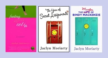
These are the UK ones:
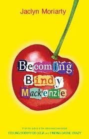

Overall: I like the Australian Finding Cassie Crazy AND the New US The Year of Secret Assignments (with the secret-agent girl). I love both titles for the book, not sure which title is my favourite. Maybe The Year of Year of Secret Assignments, as it is more attention grabbing.
What do you guys think? Would you be drawn to any of them? Which is your fave?


I'm currently reading this book!
ReplyDeleteAnd I own the white US one..it's cute.
I like the UK cover, but the strawberry looks kinda oldish. Like it doesn't look ripe or very appealing... I don't know there's just something weird about it. I do like the concept though. My favorite is the US cover, probably because I llove simple color schemes and cute fonts, but I also like the title-- Year of Secret Assignments-- better than Finding Cassie Crazy.
ReplyDeleteThanks for participating!!
I prefer the UK one, especially liking the torn/cut up newspaper spelling the the title. The German one is too busy for me, just too bright. And the US one is cute, prob my second fave and I would pick it up as I like plain covers
ReplyDeleteI like the US title better than the original one, mostly because it gives off a sense of mystery. Secret assignments? What secret assignments?
ReplyDeleteI agree with you that each cover gives me a different sense of what the book is about. The Australian cover makes me think the novel is about friendship, but the US cover makes me think the book is more of a mystery.
I've yet to read this novel, but now I'm quite intrigued!
I like the US title the best but I agree with you on the Australian and new US covers being the best. I'll be honest, I don't like the fruit with random letters. It does nothing for me and I probably wouldn't pick it up, there's just something off about it.
ReplyDeleteI gave you an award on my blog :)
ReplyDeleteEeep, I totally meant to comment on this and clearly forgot - d'oh!
ReplyDeleteI love the Aus covers, and also really like the new US paperback ones (the consistent colouring and distinct look makes them obviously appear to be packaged as a series, which I like).
The fruit covers a bit random though!
I like the Australian cover best but prefer the American title.
ReplyDeleteDoes fruit feature heavily in these books? I find the new UK ones a bit random, I'm not soured pick them up.
I would and have pick up The agjosts of Ashbury High based on the cover but probably wouldn't pick up the first two.
Yeah, the UK ones are a bit random. In Feeling Sorry For Celia, they make lemon soufflé - that's all I can think of for having a lemon on the cover and then trying to match the next ones :)
ReplyDelete