
Cover Comparison Thursday is a weekly meme hosted by Bailey @ Abyss. Head over there and link to your blog to join in.
I found a huge eighteen different editions (plus more that were slight variations on the one's below)! And, I really like most of them. Why are there so many?
Obviously this book is a global phenomenon ;)
UK
(Australian one very similar, different font)

I do like this. I like the model and her expression and I think the black and white is a little bit haunting...I like the atmosphere.
US

I like this too. It has depth in it and I love the scrawled writing in the bottom half. I like the gradient of colour in the background. It has a light, nearly whimsical feel to it. Love the blues.
New Zealand

Polish

Same model as the UK. I cant decide whether I prefer her cropped or full? Both work, I think, but to me the UK one is slightly more eerie, this one slightly more luminous.
French

Swedish

Swedish #2

Colours in this work well - the outfits and the background. As do the lines on the stairs against the lines in the rails and the dress. Despite the kiss, I think the French one does a better job of capturing that teen-y flirty sexy feel. Still, quite nice :)
German

I find this one to be a little ordinary. I don't think it has much to do with the essence of the book...?
Hungarian

This is simple, but still evocative. I'm looking at this and thinking: hope, wishes, youth. It has that same lightness that some of the others have had.
Italian

This is boring to me. High school mass produced text looking cover. Sorry :)
Spanish

Ahh, love this picture. The girls are so cute! it's fun and I think this would appeal to teens. Oh, yeah, I like this one.
Japanese
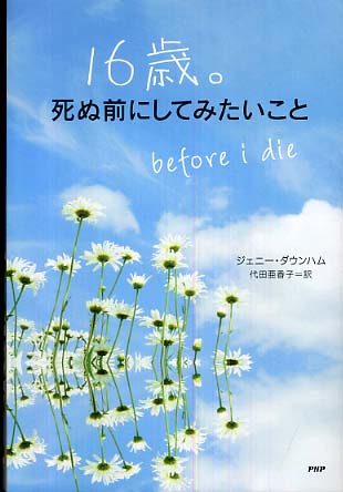
Another one going for lightness and life. It works, but doesn't exactly speak to me personally.
Turkish

Finnish

Icelandic

Chinese

At first glance I like the balloons, it gets my attention, but when I look at it for a while, it feels kind of static for some reason. Plus, I get the calendar on the bottom (in relation to the story), but not sure I like the layout of it on the front cover?
Dutch

Spanish

I prefer the picture in full on the other Spanish one.
My favourites:
- Icelandic - the bed jumping (I think this one may also be a paperback one in English... somewhere in the world :)
- Finnish - the blue tree, red shoe
Not sure why I started choosing favourites (!). I can see myself sitting here agonising for a while and changing my mind and changing it back again...
- weirdly, I do like the French one, although it doesnt resonate the same way as some others, I like the teen feel about it.
- Spanish is cute...
- Also, argh, I like so many...the US, I just like it and the NZ one too :) And, I do like the one I own - which also features a lovely spine with blue metallic writing.
Which one do you like best?


