Showing posts with label Covers. Show all posts

Monday, July 2, 2012

(!!) Cover reveal for my most anticipated book of 2012

!!!


I have been waiting for this novel for what seems like FOREVER.


Truly.

It is blurbed by Markus Zusak

'Perfectly strange, and absolutely comical and heartfelt... Jaclyn Moriarty is one of the most original writers we have.' Markus Zusak


Isn't that cover quote perfectly brilliant and EXACTLY what you would expect from a Jaclyn Moriarty novel?


On to the cover:


I love it. I like how it matches the Aussie cover of Dreaming of Amelia (even though that is a different series). It's intriguing and classy and has oodles of crossover appeal (perfect for Jaclyn, as one is never to old to delight in her stuff).


For those who don't know, Jaclyn Moriarty is my absolute favourite author. I also have this thing for her sisters, Liane Moriarty and Nicola Moriarty, who are both equally as brilliant and whimsical. Those Moriarty girls are bigger than the Bronte sisters (haha).


My favourite book of the 2012 so far is Free Falling by Nicola Moriarty (check my review). (in fact, my sister messaged me an hour ago to say she just read Free Falling this weekend in less than 24 hours and thought is was deliciously brilliant and wonderful). 


Back to Corner of White, this gorgeous novel is due for Australian release on the 18th of September 2012


More about the novel (courtesy of Pan Macmillan):
Some books defy description. Some authors make us feel as though we are discovering stories for the very first time, and seem to be choosing their words from a secret stash. 

A Corner of White (the first book in The Colours of Madeleine trilogy) is one of these books. Jaclyn Moriarty is one of these authors.

A Corner of White is a book that evokes superlatives: 
the vision is extraordinary
the writing is poetic
the characterisation deeply moving. 


Check out the blurby/jacket/synopsis:


Madeleine Tully lives in Cambridge, England, the World – a city of spires, 
Isaac Newton and Auntie’s Tea Shop. 
Elliot Baranski lives in Bonfire, the Farms, the Kingdom of Cello – where 
seasons roam, the Butterfly Child sleeps in a glass jar, and bells warn of 
attacks from dangerous Colours. 
They are worlds apart – until a crack opens up between them; a corner of 
white – the slim seam of a letter.
A mesmerising story of two worlds; the cracks between them, the science 
that binds them and the colours that infuse them. 


If any YA novel is going to blow me out my mind this year, it'll be the latest Jaclyn Moriarty xoxo

[apologies for wonky formatting. Blogger, eh? haha]

Sunday, December 25, 2011

Faves of TwentyEleven: The Covers

Faves of TwentyEleven Series

Is an event I ran all last week... until internet dramas had me missing my own event, haha :) Sorry for my absence ~ here is my final post (which I had in drafts but couldn't publish until now). Also ~ won't be able to visit all you guys but I am linked up to check you all out in the new year. I am equally excited and humble at all you awesome book buds who have joined in and made this whole event so. much. more. fun. *hi five*

Day Five (the sheepishly late edition): The Covers

TEN favourite covers selected from books you read in 2011

These covers are from books that came out whenever, but that I read this year...


Burn Bright really is a stunning cover, especially in the flesh. It's got a gorgeous waxy texture. It's striking and dynamic and pretty much perfectly suits the gothic and enticing read inside.


Oh this cover really shines. It's perfectly summery and smiley (the watermelon is smiling) and the hues in the blue are pitch perfect. I love the title font and the little book slogan thingy too. (Also a fan of his 2011 release which I also read this year: Black Painted Fingernails)


I didn't know how much I would love this cover until I saw it in person. Also, the fact that I love the book really helps in furthering endearing the cover to me (I just want to hold this little gem tight to my chest). This cover is pretty much perfect to me and I would love to see more simple and meaningful gorgeous little covers like this in the YA genre. 


Oh ~ I REALLY love this cover. The girls expression (and her cute dimple), the sunny/summery vibe. Also I love what's going on with the title font <3 This cover just completely appeals to me
Note: I also gave this book 5 stars. Oh, I love it so...


This cover has nothing to ddo with the book (well, if it does, I still haven't figured it out) BUT I love it regardless. 

Sure, it looks like a movie poster ~ but it is completely visually arresting. I LOVE the stormy tones against the red flare <3


I like the simplicity in this. Also, the purple font for some reason :)


I think this stock photo is evocative. Completely appealing...


Guys, you really have to see this one in the flesh. It shines. Completely, utterly captivating. The inside is just as gorgeously designed.
Oh, Froi of the Exiles is SUCH a beautiful book. I love the colour scheme and the scope in this cover. I love the font and the illustrative touches. And Froi looks fab ;)

a few runners up:


Bizarrely, as I was perusing all the covers of the books I realised there are a lot more covers I don't like than do. So many of then make me cringe, smirk or just turn me off in general. (That is for YA covers and adult). I'd never realised that before, just how many covers I do not like... haha

I guess we all have different tastes in covers so I hope you've liked seeing a few favourites of mine from this year. Can't wait to check out all your posts. Thanks to everyone who joined in and sorry I went awol on my own event ;)

I am off to the mountains until 2012 and will  be relaxing with family and not going online for a week or so (As much as I love my online life, I also love breaks from the internet = bliss). See you all in 2012

*also, am on a mates Mac and I have NO IDEA how to format on here, haha. So ~ just chucking it up as is. Hope you've all had a brilliant Christmas ~ it's all over here for us Aussie, and mine was SO fab. Looking forward to kicking back and doing nothing for a while x


Sunday, December 4, 2011

hard cover v paperback {6}

Hard Cover V Paperback is a sporadic feature of inkcrush where I chat about which cover I prefer, etc...
(sorry for the formatting of pictures in this one ~ blogger's a bit messy ;) ~ driving me wild, so am leaving as is and moving on ...)

Split by Swati Avasthi

Hard Cover V paperback

FIRST: the paperback is still at a bargain preorder (for Jan 2012) price. 
It's one of my fave reads this year... so get to it :)

Hard cover: I liked it. The key is part of the story. The red, black and white are arresting. I am SUCH a fan of lowercase, I can't help it, I just am. ALSO ~ I didnt spot it for a while (then had a 'duh' moment) but there are profiles in the cute of the key. cool optical illusion...

Paperback: Normally I am not too fussed over having models on a cover. But, I am REALLY digging this. I love him in profile, love the black and white (it's evocative) love that floppy hair ;) It's curious it is the same colour scheme as the hard cover ~ yet so dramatically different in vibe. Also, it's uppercase is cool here ~ so understated and simple. Like the opposite of the hard cover.

My fave: I am LOVING the paperback. I know there's not much to it, but it's calling out to me. I love it's simplicity. I think it is going to look stunning in the flesh (I am almost tempted to buy it, just to have another copy of one of my favourite books ;))

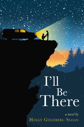
I'll Be There by Holly Goldberg Sloan


Hard cover V paperback

Hard cover: You guys ~ this one is one of the most coveted covers of the year. It's mesmerising and gorgeous and such a stand-out with it's illustrative work. I have heard it is equally gorgeous on the inside (interior design, LOL, is it called that? Whatever). This one feels like a picture telling a thousand words. It's practically screaming READ ME.

Paperback: Initial reaction: looks like the face on the new Delirium (Lauren Oliver) cover. Oh, there's a boy, whispering and/or sniffing. I do like the concept, how if you go cross-eyed, you notice more of him than her. I'm a fan of the colour and the black and white and I especially love that slightly fuzzy red font. It's only when I think about this cover that I find things to admire, it doesn't grab my instant attention...

My fave: I get why publishers change things, I do. But that aside... WAHHH! I LOVE the hard cover SO MUCH. I do not own it (haven't read it). I am not a hard cover girl, I prefer buying paperbacks. But this one is making me think investing in the hard cover of this book may be worth having it on my shelf... (I could handle the paperback though, it just seems such a shame to miss out on owning that hard cover masterpiece) 

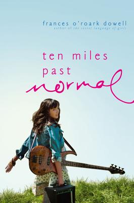
Ten Miles Past Normal by Frances O'Roark Dowell

Hard cover V paperback

Hard Cover: I loved this cover when I saw it last year. The girl, the paddock, the guitar, the dots of what looks like black sheep, the unruly grass and the scattered font. I wanted the book based on the cover (and title ~ which also rocks) alone [note: I kept an eye on reviews, and then didn't think the book was for me after all :/ ]

Paperback: I REALLY love how the two versoins are tied together by the same photo shoot. So I am just going to compare aspects here. I like the font in the paperback better (more unruly). Somehow, the girl looks photoshopped in on the paperback ~ she's so much more CRISPER. I do prefer seeing the farm on the hard cover ~ kind of cooler for some reason. I like the gradient in the sky on the paperback, makes the hard cover seem flat in comparison. 

My favourite: I don't have an obvious one. They are both pretty funky. Maybe the hard cover looks more original and eye-grabbing? I would blend in my fave paperback aspects and smish them together on one cover :) 

Does this cover remind anyone else of the book 'Somebody everybody Listens To' ? The dress, the jacket, the guitar...

Cryer's Cross by Lisa McMann


Hard Cover V paperback

Hard cover: Creepy. I LOVE this cover. I love how it matches in with Lisa McMann's US editions of the Wake series, yet is it's own thing entirely. The scratchings on the desk are genius (I love creative title text). I love how the background fading out makes the centre luminous. The old style table and chair set are spooky sitting there, all ominous-like. Love the colours and tones. 

Paperback: ... So ... While the trees are going for spooky, the scene is going for telemovie romance. It's like a tame harlequin cover or something. This is a YA book, right? The couple on this cover look too old to be teens to me (?). I haven't read the book, so I can't comment on how well the cover portrays it's contents (in terms of vibe, genre) but it looks like they are marketing two different stories to two different audiences. 

My fave: Hard cover. Creative, simple and effective. The paperback is so generic, and I have NO IDEA what the book is about based on it? 

What are your faves? Any you don't like?

My verdicts: 
Split: paperback
I'll Be There: hard cover
Ten Miles Past Normal: mutual :)
Cryer's Cross: hard cover

Wednesday, November 9, 2011

inkcrush chats

So, time for some (random) stuff to share with you guys...

One: Cath Crowley shared the Italian cover for Graffiti Moon yesterday:

Oh, I am really liking it. It's one of those covers I can keep looking at. I love how it is the same cover scheme as the Aussie cover. I love how it is arty (Graffiti Moon is such an arty book, you guys). What do you guys think?

Speaking of covers...

Two: Braiden alerted us all to the Aussie cover of Cynthia Hand's Hallowed, #2 in the Unearthly series. Here it is, next to our cover for Unearthly:


I am rather fond of it. It is so wintery (a little bit Narnia-esque, LOL). It pulls me in. It feels a bit mysterious, the girl seems sad, bereft, even. It's a midgen whimsical. I think the white on the shelves will stand out. Overall, I am liking the atmosphere of the book. In other news I HAVE READ THE BOOK (thanks netgalley!) I will review soon in full. It has been so very well received so far, and I really (really) enjoyed it. I liked Christian a lot in #2. Also, it was a very sad book, in so many ways. What do you think of the Aussie covers for this series? 

Three: Speaking of cover reveals... I was REALLY excited to spot a cover for 2012 YA debut author Elissa Janine Hooles' book, Kiss the Morning Star (saw it updated over on goodreads):
I have been excited for her book ever since I first read about it. Seeing a cover makes it seem that much closer :)

Four: Did you guys know about Aussie YA Month over at The Crooked Shelf?

Carla has already had some BRILLIANT posts (interviews, guest posts and reviews) and I know there is so much more of the AWESOME to come. (including giveaways and more from some of my favourite authors).I am seriously LOVING it.  Here's a teaser where Carla interviews Melina Marchetta.  and a gorgeous post by Adele of Persnickety Snark. LOVE IT

Five: Speaking of Melina Marchetta...

I just finished reading her latest book Froi of the Exiles. (Book Two of the Lumatere Chronicles). It was especially fun as I had a read-along with one of my fave readerly people, Flannery. We chatted in a google document (sometimes live, which is so. much. fun.) and other times updating our progress as we went chapter by chapter. We raved and speculated and tried to predict what was going to happen (being an MM novel, you know anything could happen). We are both doing a bit of Nanowrimo this month and would love to count our Froi document towards it as our total word count for our Froi discussion was... 23, 462 (which is nearly half of the nano requirement). Good, good times.

In regard to the book (Froi): it is a brick of a book and the story itself is intricately woven. The world building is seamless, making the events and places seem real (how does MM do that? Just create an entire world out of her head). I wondered how I would feel about Froi as a narrator (after some of his early actions in Finnikin) but FEAR NOT! ;) I loved him from the start. He does not take himself as seriously as Finnikin did (he is a pretty funny guy) and he has some charming and tender moments, aww... Here's a perfect quote for the book...

'Why did everyone in Charyn seem to have a story in their eyes? And when had he (Froi) started caring?' p403

In terms of the story, my gosh, the people of Charyn (!) ~ some of their stories will make the stories of the Lumaterans (from Finnikin of the Rock) seem like children's bedtime stories in comparison. It is one wild ride. In comparison to MM's earlier work, I would say this would be the fantasy version of Jellicoe (so much more pain and suffering and heart-breaking history, also, there are moments of confusion for the reader, before the threads all start to ~ masterfully ~ pull together) More on Froi later... (before I launch into an impromptu review)

Six: The Inkys! wOOT!

Well, the winners were announced at the beginning of this month...

Winner of the GOLD INKY for most popular Aussie YA is 'Silvermay' by James Moloney
Winner of the SILVER INKY for most popular international titel is Cassandra Clare's 'Clockwork Angel.

Congrats to both winners!
The inkys are Australia's only YA awards voted for exclusively by teenagers :) More about the inkys on inkcrush :) For the Gold INKY, I had read all of the shot-list, except Silvermay ~ which I am SO hoping my library will add to ther catalogue soon, as I am very keen to read it (James Moloney is an Aussie YA author I grew up reading, and he is still going strong).

Seven: Back to Froi of the Exiles (I nearly forgot)... Fellow Aussie blogger, the lovely Kathy Bradey of Once Upon A Tine In Writer Land is giving away a copy of Froi and she is (generously) making it available INTERNATIONALLY for all you guys who cannot wait for the US release date (of who just want our gorgeous cover) Go forth and enter (and good luck!)

(closes 1st of December)

Eight: Not really a point, just signing out :)

..

Okay, maybe I have more to say, haha... Sorry for the random overload in this post... Also, I still have a backlog of reviews to spit out. I am a casual blogger, I don't commit to posting certain days and whatnot, and I let the blog lie dormant occasionally while I am cruising around in the real world... but, brace yourselves, as I am going to try and cram in a bunch of reviews before the end of the year stars catching up on me...

x Nomes


Monday, July 25, 2011

Cover Reveal: Legend by Marie Lu


Today Penguin Australia revealed the cover for one of my most anticipated reads this year: Legend by Marie Lu. 


The cover above is the Aussie/UK edition.


I LOVE IT


I love the colour scheme ~ light and dark and shadowy and luminous all at once. I love the symbol imprinted in the top left corner. I like the glimpse of the dystopian world ~ and the girl in the combat boots on the cover <3 


 <-- The US cover of Legend.


I do like the US cover too ~ it's striking in it's simplicity ~ but I think my fave this time is the Aussie cover :)


Which cover do you like best?
Have you read Legend yet? (there are ARCs out there)
Are you planning on reading it?


The blurb of Legend: The United States is gone, along with its flooded coasts. North America's two warring nations, the western Republic and the eastern Colonies, have reached a breaking point. In the midst of this broken continent and dark new world are two teenagers who will go down in history . . .

Born into the slums of the Republic's Lake sector, fifteen-year old Day is the country's most wanted criminal. A mysterious boy with no recorded image or fingerprints. A boy who should no longer exist. A boy who watches over his family until one evening, when the plague patrols mark his family's door with an X - the sign of infection. A death sentence for any family too poor to afford the antidote. Day has no choice; he must steal it.
Born to an elite family in the wealthy Ruby sector, fifteen-year old June is the Republic's most promising prodigy. Obedient, passionate, and committed to her country - until the day her brother Metias is murdered during a break-in at the plague hospital.
Only one person could be responsible.
Day.
And now it's June's mission to hunt him down.
The truth they'll uncover will become legend.

Monday, June 6, 2011

hard cover V paperback #4


hard cover verse paperback is a sporadic feature @ inkcrush
all links for blurbs, etc, go to goodreads

the four books featured today are all currently available in hard cover and pre-orderable in paperback.

hard cover                               paperback 

Both of these are conceptually awesome. There's been a lot of thought into integrating the title to match the theme. I LOVE the skinny apple on the paperback.

My favourite? hard cover. 
I can't go past that electric shiny purple of the hard cover. It really grabs my attention <3


hard cover                                         paperback

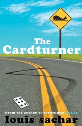
Hard cover: I love it. It's already got a unique vibe going on ~ kind of like a poster for a funky indie film. LOVE the spade in the title and the cleverness of the tagline. The use of white space is also really satisfying for some reason.

Paperback: I love this too. It's bold and vibrant and still has an off-beat feel about it. The colours work so well together and are really streamlined. LOVE the whale on the sign, the burn-out tracks and the card on the ground.

My favourite: ahh, I'm torn. Absolutely undecided. I think both are excellent covers


hard cover                              paperback

hard cover: While the colours are well matched and the cut necklace is clearly symbolic, I cannot say this cover does much for me. The cut pearls look... awkward.  

paperback: I don't like this one either although I think it probably has better teen appeal than the hard cover. The bodies are headless (!) in a choppy way,  and the whole scene just looks so posed. from the girls leg caught at a weird angle to the guy wearing that suit. 

My favourite: sorry ~ I'm not really liking either :( 

bonus: UK original cover and the (US) sequel cover: 
you can see how the US sequel matches the new paperback theme. 
I like the UK one the best out of them all...

hard cover                              paperback

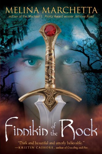
the new US paperback is an atmospheric blend of the US hard cover and the Aussie cover: -->

My favourite: the paperback. I think it's absolutely mesmerising ~ Finnikin's eyes are the focal point and then my eyes stray to the smoky background and ominous branches. 


Which covers do you love the most?
Have a particular favourite?

xx Nomes