
Looking For Alaska won the Printz in 2006.
Hard Cover US
(Also the edition I read in Australia)
(Also the edition I read in Australia)

Iconic, clean and minimalist.
Also, kind of edgy for some reason?
Also, kind of edgy for some reason?
Paperback

Evokes a feeling of a nostalgic summer
Classic coming of age vibe
Classic coming of age vibe
New Zealand & ?

not bad, but I'm not sure what it's aiming at?
slightly whimsical. Not so appealing for guy readers though.
slightly whimsical. Not so appealing for guy readers though.
UK

This one, I love.
It feels perfect. Hopeful and quirky.
It feels perfect. Hopeful and quirky.
Italian

Haha
I have no idea where this design concept came from
But for some reason, I cannot look away...
I have no idea where this design concept came from
But for some reason, I cannot look away...
German

This looks more like adult literary fiction than YA to me.
Spanish

I like the ideas in this - the maze and leaf and shoe.
But it makes me think of my high school science text book for some reason.
But it makes me think of my high school science text book for some reason.
Polish

Circa 1980's style.
This one isn't for me.
This one isn't for me.
French

Similar vibe to the UK - perhaps more male friendly though.
I'm digging it.
I'm digging it.
Dutch

Again, I like the concept idea: burning cigarette, lipstick kisses and a scroll.
But overall, it's a little too blah for me.
Lithuanian

I don't mind this. I'd like it to be a touch grungier/scratchier around the edges.
Also, are they boys jeans or girls jeans? Can't make up my mind...
Japanese
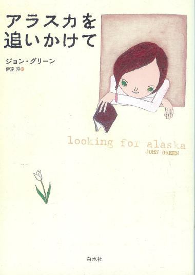
Heheheh.
Another minimalist vibe. It's kind of cool :)
Danish

Ooooh! Moody!
I like the eyes in the trees and the road disappearing into fog.
This one reminds me of a movie poster.
Portuguese

Which one is your favourite?
Any that amuse? Make you laugh? Any you wish you could own?


I REALLY love the US paperback cover! Never saw it before. I have to admit that the hardcover always kind of confused me. :/ UK cover is awesome too. Love the simplicity and the little blurb.
ReplyDeleteI love the US hardcover! I haven't seen the US paperback either, I really adore that one and would definitely pick it up but I don't think it captures the mood of the book at all.
ReplyDeleteI love the Japanese one but again the mood is wrong and the Italian one is freaky!
ahaha! you are so right about the science book. :p
ReplyDeletei like so many of these. he got some great covers all around the world, but i have to say i'm in love with the US paperback. i had never seen that cover before.
oh gosh, i love this book so thanks so much for sharing all these covers!!!
ReplyDeletei actually read the US hardback one (the black with the smoke, which i like although its a bit too neutral). i really love the PB one but i dunno.. it feels a bit soft (love the tagline though) im only okay with the NZ one, its also like the PB I see in canada. too... cliche.
UK is cute! bit too cute maybe... :p hahahaa see how picky i am? italian is weird.. and honestly creepy. french one is awesome.lithuanian one is okay and unoriginal, not really a fan of the japanese one, but i love the danish one too. so many awesome choices!! hahaha im a big fan of judging covers.. sorry for this super long comment :p
I like the French one with the labyrinth on the cover, an apt symbol for this book I think. I don't know about that Italian one - creeeeeepy!
ReplyDeleteOne book and so many different feels of the cover! I like the UK one and the original hardback :)
ReplyDeleteI think I love the 2nd best :)
ReplyDeleteThis is one of my favourite books. I love the Danish and UK edition. The Italian made me laugh - I don't get it. Great post :)
ReplyDeleteMy personal favorite is the American cover, but I love the creepiness of the Italian cover too.
ReplyDeleteI do like the UK cover, although when I ordered this I thought I was getting the US cover, which I prefer. Love the Japanese one, which doesn't really go with the story for me... but it's cute.
ReplyDeleteOh, and I *think* those are girl's jeans. In any case, boys don't tend to stand like that, do they? Not too sure.
Wow that's quite a variety of covers! Not sure which one's my favorite but I have to say the Italian one totally freaks me out.
ReplyDeleteOkay that Italian one is just weird - I still love the first one though.
ReplyDeleteI love the UK cover! Cute and lovely.
ReplyDeleteThat UK paperback is the one I read. It clearly didn't find a market though, unfortunately, as it remains the only John Green novel to be published in the UK.
ReplyDelete@ Gary - wow - I didn't realise hiw other books weren't picked up by the UK. We have all of his books here in Australia.
ReplyDeleteLove this post!!
ReplyDeleteThe US hardcover and the New Zealand ones are both available in paperback in Canada, just so you know :)
I just ordered the new one - the HarperCollins edition, blue with the heart in the middle, but I like the UK cover best. You're right, it's quirky and perfect and I wish they had it on The Book Depo.
ReplyDeleteI don't really like the smoke one so I ended up not ordering the hardcover even thought I'm not a fan of paperbacks.
Wow, that's a lot of useless info. Sorry. :)
Does anyone know a place online to buy the australian cover?!?!
ReplyDeleteI want the uk cover with the print of the word Alaska in yellow with incredible ferocity. I like the United States. If anyone is willing to do a trade or let me buy a NEW copy with American dollars SOMEBODY JUST POINT ME IN THE RIGHT DIRECTION BECAUSE I NEED THIS COVER PLEASE. My e-mail is katy5214 [@] ymail.com but obviously without spaces and the []. Please, it would mean so much to me. I NEED this cover.
ReplyDelete